Editorial design can employ nearly all disciplines of print design, including typographic design, conceptual design, and appropriate use of imagery. There is a story to be told; your job as a designer is not to compete with or distract from that story, but rather to illuminate it, give it an engaging visual presence and entice the viewer to interactive with (aka READ) the content.
Objective
You will create two spreads of a printed magazine article, using the content provided to you. You may use image, typography, color, mood, texture or (as is likely) any combination of these to create a design that entices the viewer to read the content. Your design must keep the viewer engaged throughout the article by using your arsenal of designer tools (hierarchy, size, etc) and by working from the visual motif established through your opening spread in concurrent ones.
Project Specifications
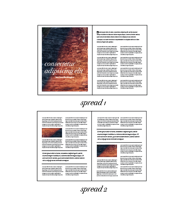
- 2 Spreads of 16 x 10.875 (8 x 10.875 x 2 pages for each spread)
- Physical and Digital Submissions
- Photography and Illustration must be your own
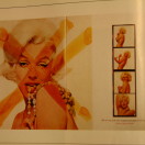
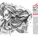
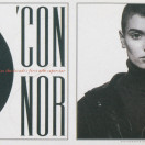
- You will choose from these:
SympatheticSympathetic
Your design should take up 2 spreads entirely, and no more.
Project Guidelines
- Your body type should likely be somewhere between 7-10 pt, with your leading approximately 130-140% the point size.
- You should leave sufficient space for the middle fold (no less than half an inch).
- Your structure should appear purposeful; similar-width columns should be the same width.
- Do no allow widows or orphans, and avoid rivers and valleys in your type.
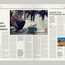
- Your opening spread should be evocative. You should have at least 2 images in addition to the opening spread, and at least 2 pull quotes.
- Your project must display an ability to use type and hierarchy to retain a viewer’s attention and guide them through the article.
Part 1 Instructions
Step 1
Begin researching editorials spreads and considering the style and approach you’d like to take. Provide at least 2 initial concepts/sketches of your opening layout and the secondary layout by the class after project assignment (required), showing how the theme will continue to the next spread. (Late submission of these will result in point loss.)
Tip: To get an idea of the space you’ll have to work with, it’s a good idea to create a document of the final size and drop the text in at a reasonable size (7-10pt depending upon your typeface choice). This isn’t meant to serve as your final document, just as a guide in showing you the space you’ll have available.
Step 2
If you haven’t sufficiently explored how your visual theme will be extended into your second spread, provide sketches and research (images of inspiration material) that indicate how you will key the viewer that they are still reading the same article and keep them engaged. This is required, though you may show this comped up in software if sketches don’t give a good picture of what you’re doing.
Step 3
Begin creating your art for your spread, whether it is illustrations to be made, photos to be taken, or computers to take apart.
Step 4
Begin laying out your design in Illustrator or InDesign. We will discuss issues such as type handling, hierarchy and visual consistency.
Step 5: Submission
Digital Submission
Create a pdf (2-page pdf) from your working file(s), and package up all your working files. Place all your files for digital submission in a folder labeled [lastname_firstinitial_project3] and drop them in the dropbox by the start of class on critique day.
- Working files (with images and fonts packaged together)
- 2-page pdf
Physical Submission
Create a full-size print of each spread and have them ready at the beginning of critique.