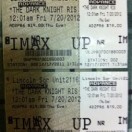
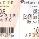
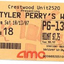
The Problem
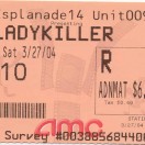
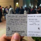
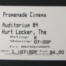
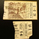
Examples of bad design can be seen everywhere, but curiously abound within mundane, everyday items (AKA things we use all the time) like licenses, boarding passes, and event tickets.
One of a designer’s primary tasks is to relay information in such a way that it is easy for the end user to find the information they need. This involves categorizing information, creating hierarchy and generally guiding the viewer through the material in such a way deemed appropriate.
Designing information-heavy graphics requires first considering the usage of the item, what pieces of information are the most important, what should most easily viewable, and what things should be grouped together according to the varying users of the item. In the case of a driver license, the users would include individual drivers, cashiers, and police officers. The design resulting from these considerations should result in an easy viewing experience for everyone involved.
The Objective
You are to design a movie ticket template in such a way that reflects the way you believe tickets should be read, and the things you find to be most important. Working within the given parameters, you will use design fundamentals such as size, negative space, color and proximity to re-imagine what a movie ticket should look like. You will include all the information required and also keep in mind what information needs to be able to change in length.
The best information design achieves proper functionality while also remaining aesthetically pleasing. Ugly graphics can be distracting, but a well-handled design is often invisible.
Specs
- Ticket Attached Dimensions: 5.5″ x 2″ total, with a stub that is 4″ x 2″ and the smaller portion 1.5″ x 2″
- Black, one tone of grey, and up to 2 additional colors.
- No screens, transparency or gradients.
- No imagery. You may use blocks of color or circles to highlight information.
- You may use one vector symbol or icon
- 2 tickets, using the exact same layout but different information, given here.
- Use the barcode and AMC logo here.
Hint: the AMC logo doesn’t need to be huge on the tickets.
Instructions
Planning and Digital Sketching
The first thing you should do is look at the information provided and the way in which this information typically appears on movie tickets. You should then write down in your sketchbook the way that you feel this information should be categorized and what information deserves the most prominence.
You will then create 3 distinct, full size digital sketches – with no color yet – of different approaches to presenting the required information. Focus on things like:
- Hierarchy: Really make the most important things clear. Bold or colored text isn’t the only solution here.
- Organization/Categorization: Group information with a purpose.
- Alignment: A clear structure should underlie your information.
We will review your list and your sketches and decide on one approach for you to flesh out in Illustrator. This is a required step, and nothing beyond this step will be reviewed (and therefore your project won’t be accepted) until you’ve completed this step.
Creating Your Layout
You will then continue to build your layout in Illustrator, based off the chosen direction and any extra feedback you received. You will create one design that will be used for two different sets of information. Do not change the position or size of any pieces of information from one ticket to the next. The point is that you’re creating a design that works for variable information.
You should have your layouts built and ready to receive feedback by the day before the project is due, so that you might make revisions before turning the project in.
Submission
You will turn in a digital and physical submission for the project. For the digital submission, place your working file(s), a pdf of each ticket, and any fonts used in a folder labeled [lastname_f_project-4 and place it in the dropbox before the beginning of class on the project due date.
For your physical submission, turn in a full color letter-sized print, with both tickets presented on the same page, centered on the page with at least 2 inches of vertical space between them.
