You will be re-designing a logo to be determined in class. Below is a document that you should download and use as a guide to research the company and to establish your vision of how the re-branding should look. This will evolve over the semester, but should give you direction and something to base your visual approach on.
Step 1
Download the following document and fill it out according to your research. Your answers should be succinct but substantive and descriptive, giving a clear direction as to how you plan on approaching the re-design. You should also provide any visuals that will help to communicate how you plan on approaching your project. You should begin gathering the materials that will be presented in step 4, as this is part of your research. Due day after assignment. Questions
Step 2
Begin gathering imagery that gives some idea of the visual direction you’d like to take with your company. This can include textures, typography, color and anything else that gives a better idea of what your ultimate aim will be. At least ten, to be show to me with your sketches.
Begin sketching your ideas for the re-designed logo. Use some of the same methods we’ve employed in the past for generating logo ideas, such as word lists and preliminary object sketches to give yourself a visual vocabulary to work with. You should have at least 20 well-defined sketches at this stage. After around 10, you may begin to make alternate versions of your first attempts, but there must be substantial differences in the marks. Due 1 week from assignment.
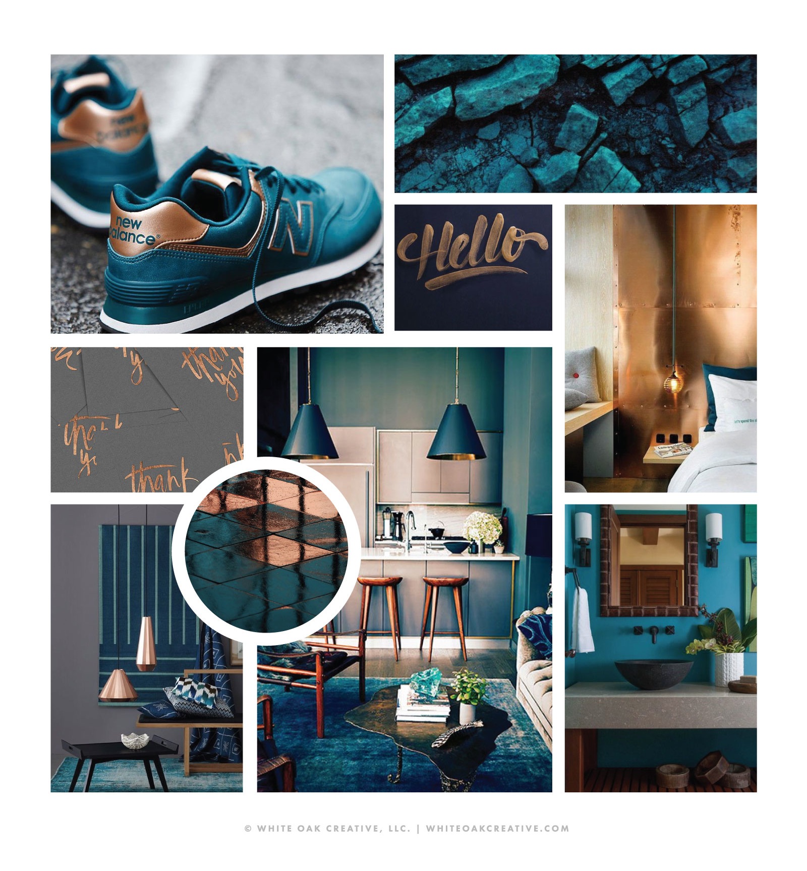
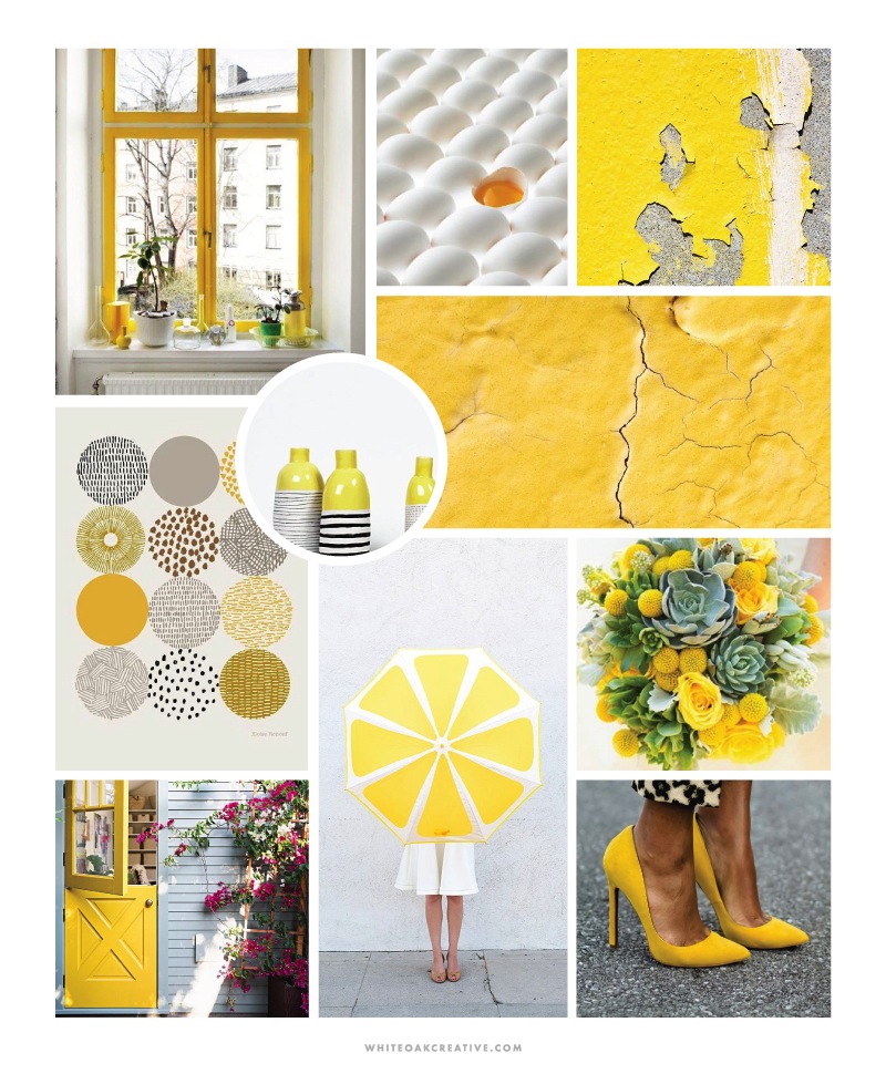
Examples of image collections:

Step 3
After receiving feedback from instructor and agreeing on the best 3 directions within your exploration sketches, you will create working comps in Illustrator for each of the 3 directions to be presented one week later. These need not be finalized and overly finessed, but they should be comped up well enough to give a good indication of what the logo will look like. From these, we will choose one logo to move forward with. These logos should be presented in black and white (no grey), and each no larger than 2in in either dimension. (They should fit within a hypothetical 2x2inch box.)
Due one week from first sketch review.
Step 4
After deciding on your best direction from your rough comps, you will finesse your mark and turn it into a final logo. We’ll discuss details and typographical issues, and you will rework your mark according to our consultation. You will add color in this stage: up to three colors total (black being considered a color), for a limited color version.
These will be presented on the projector by yourself one week from the choosing of your logo to move forward with. You will also be presenting a well-organized collection of at least 10 images ( a pinterest board, a pdf, a folder of jpgs) that give some indication of what your vision is of the company. A collage works well as it gives an all-at-once visual glance of your vision. It’s your choice of how to present them, but your imagery should be organized so you can quickly access the images. This can include color, texture, style and other elements that give inspiration to what you are doing, and doesn’t all have to be positive: you can also show what you don’t want to do.
Due on project submission date:
- Presentation of your vision for your company through a means of your choice (multi-page pdf, images on a pinterest board for example, collage), so long as it appears professional and your presentation is not a distraction. You should be able to speak about what you’ve made, why, and how it addresses the questions you answered to begin with.
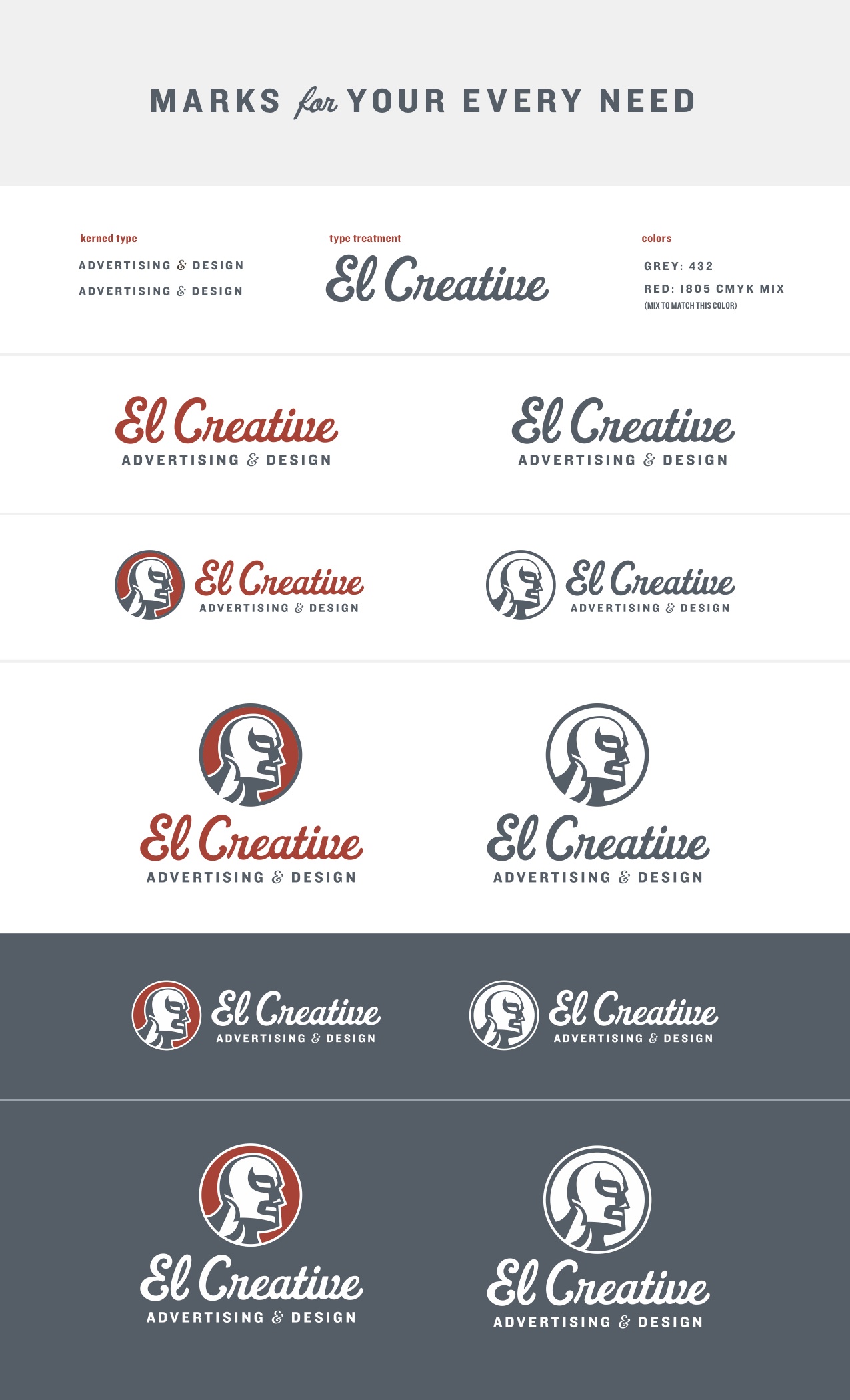
- Black and White, Limited Color logo (Up to 3 colors total, no screens of these), and fully rendered logo (unlimited color version if you have one) presented on projector. This should be presented in the form of a data/brand sheet, which shows the “legs” of your logo system. Show the mark dark on light, light on dark, stacked, horizontal, and any other orientations that you actually think work. Show simplified versions of they would be necessary with your mark, such as a crest which would need to be broken down if very small.
- Logo printed out on black and white, at 3 sizes on one page: within 3×3, within 2×2, and within 1×1 (There should not be a literal box visible.)
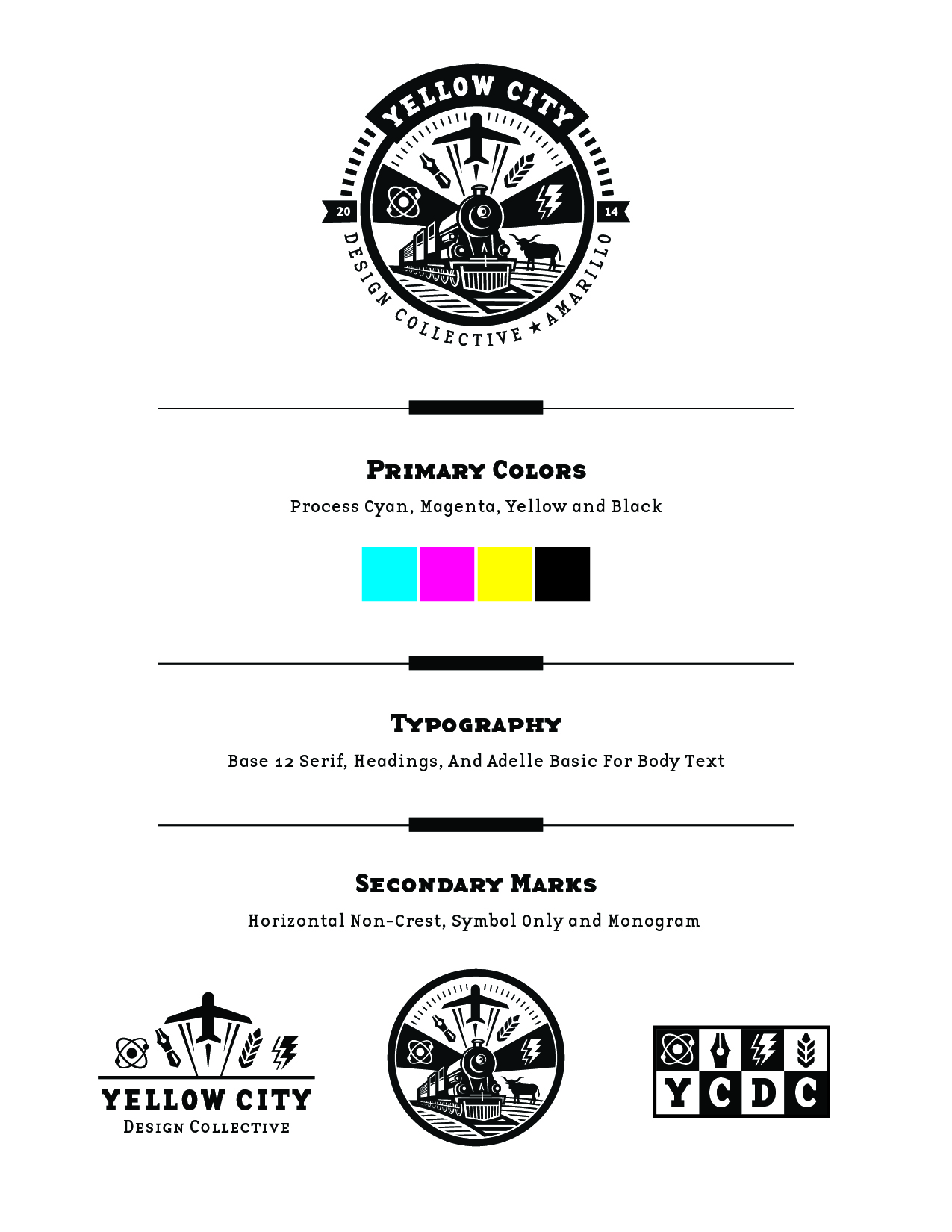
Examples of the logo presentation: